- Client: Biosense
- When: 2011
- Team: 2 Designers and Developers
- My Role: Designer and Developer
Overview
In the Fall of 2011, I had the opportunity to re-design and develop a new website for an Indian medical electronics startup. Along with a friend of mine, we conducted initial user and market research, designed the user experience and interface, created all graphic and visual design assets, and developed the website using HTML, CSS, and JQuery for a remote client half-way across the world in India. We both had full-time positions as Mechanical Engineers at the time and used our evenings and weekends to work on this project.
Problem Statement
Every minute, two people in the world die from Anemia–a completely curable disease! One may think that perhaps the cure is not well distributed, but that is not the case. In fact, the weak link in the chain boils down to lack of accurate diagnosis. With a false positive diagnosis and treatment, dangerous complications occur. With a false negative diagnosis, no life-saving treatment is offered.
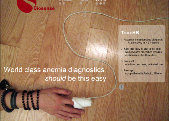
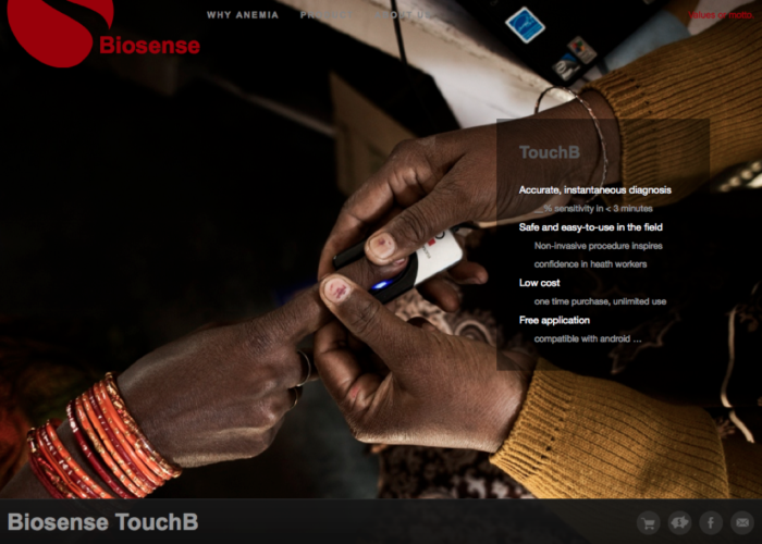
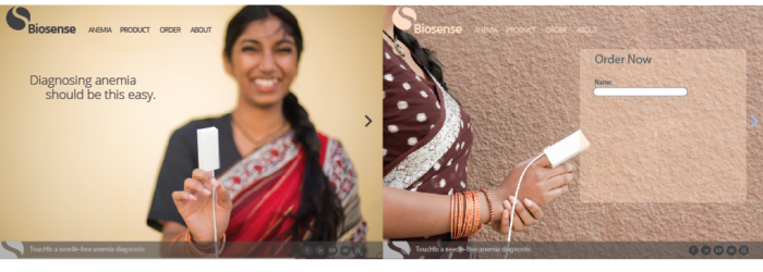
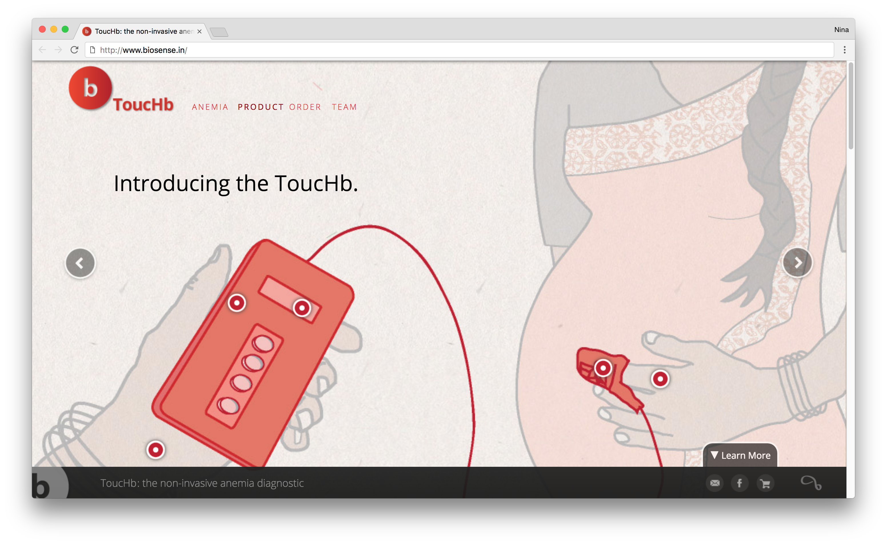
Biosense’s TouchHb product addresses this key moment in the chain by providing a reliable, portable, non-invasive diagnostic to healthcare workers. TouchHb targets mobile healthcare workers in rural India with its low cost and minimal profile.
Our client asked us to re-design the existing Biosense website so that it was easier to use and more engaging.

Design Research
After determining that the website’s target audience would be the health care workers in the field and potential investors as opposed to the rural patients, my partner and I began with researching how to best design a site that could convince our target audience that TouchHb was a valuable product in which to invest.
We studied the history of anemia, key statistics, and existing solutions. We learned that though information was plentiful, it was not common knowledge and scattered.
We interviewed potential website viewers. With investors, we found that our biggest obstacle with was demonstrating the importance and need of TouchHb for people of the emerging world. Investors often did not realize the extent of the problem and how a solution was right at their fingertips. As we interviewed healthcare workers, we learned that many were entrenched in the mindset that reliable anemia diagnostics were only available at larger hospitals and had to invasively draw blood. We needed to make it clear that that was not the only option available to them. A portable and non-invasive solution could now be purchased by individuals at a fraction of the cost.
We researched how to best share our knowledge and achieve these goals, and came to the conclusion that our website needed to tell a story. From there, we began designing and prototyping what an immersive storytelling experience might be.
Storytelling Information Architecture and User Experience
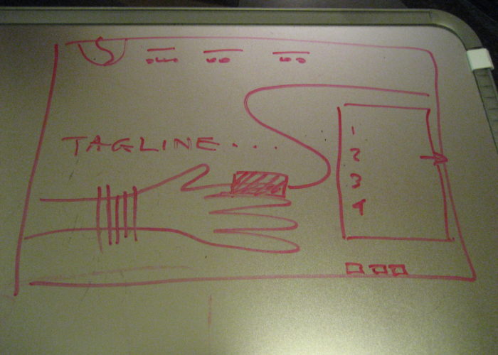
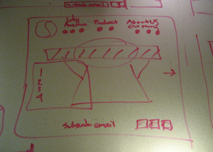
As we dove into the storytelling and user experience, we worked to simplify our story down to absolute essentials. A full-page, immersive slideshow analogy began to form as our chosen tool of expression. We strove to make our design friendly, engaging, informative, and a clear call to action. We wireframed various iterations out on the whiteboard as we cycled through this process.

Since my partner and I were both the designers and engineers on this website, we were careful to design a website that achieved all our goals independently from engineering challenges. After we were confident in the framework of our design, we determined what the best way to code our solution. Naturally, we faced some key engineering tradeoffs. For instance, we wanted to use a CMS, but realized that our schedule and resources would not allow us to complete the design we wanted with a CMS.

When we handed off the completed website design to our client, we provided them with all the final code, visual assets, and a
guide to the code.
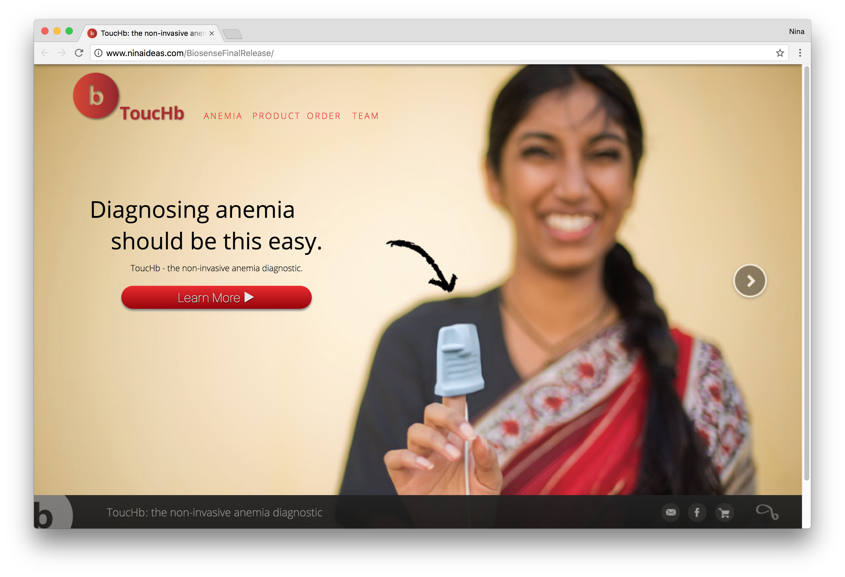
Landing Page User Interface and Visual Design
On the visual design side, we followed a similar process of iterative design with colors, graphics, photography, and individual page layout. Throughout the process, we checked in with our client to make sure that they were satisfied with our progress and we tested our designs through interviews, usability tests, surveys, and A/B testing.
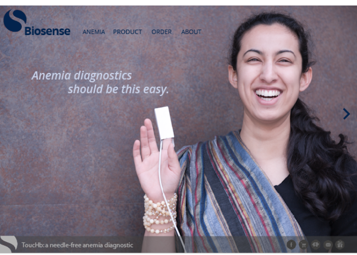
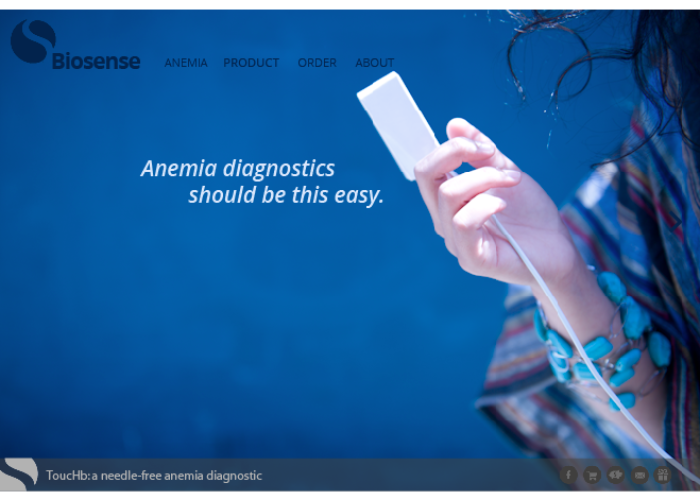
We settled on using a theme of warm colors that had earthly tones along with a red to subtly reference the blood associated with anemia.

Let’s dive into our process for the front landing page. Our process for all the other pages was extremely similar.
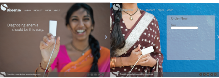
For the front page, we created initial wireframes of full-screen slideshows as well as framed sliders. We explored where we wanted information to be presented, and how we wanted to indicate how a user was to interact with and move through our story.
As we regularly checked in with our client, we created prototypes to share our progress. We started with simple static prototypes and gradually progressed into functional prototypes.
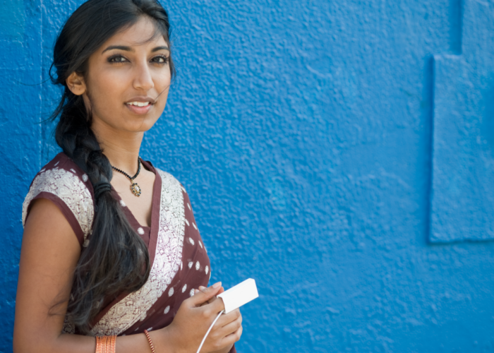
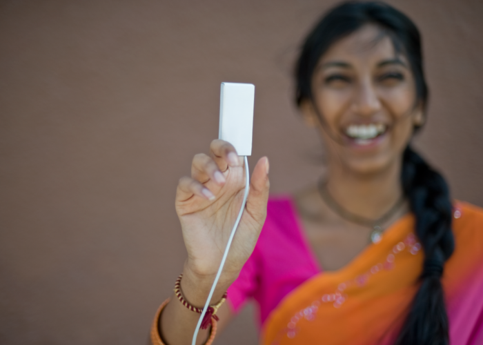
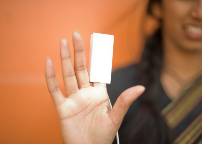
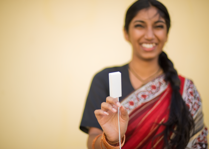
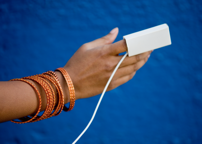
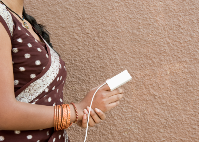
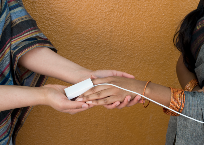
Once we were confident with the framework of our website, we began prototyping our visual assets. We had several photoshoots where we played with colors, framing, and composition. In our first photoshoot, we rented a nice lens and photographed ourselves in preparation for when we hired a model and on the off chance we did not need one. After looking through our shots, we needed a model.
In our second photoshoot, we hired a model and coached her through the session. We played around with various backgrounds, attire, facial expressions, positioning, subjects, lighting, and composition. At the end of our session, we had a massive library to chose from for our story.
After choosing our top images, we created rough static mockups of key pages side by side for feedback. We used side by side comparisons to determine our final combination of photographs.
Learn More
If you would like to learn more about Biosense’s ToucHb, watch their TEDx talk: A 20 second blood test without bleeding from 2013.