AT&T Design Thinking Workshops
  • Client: AT&T Foundry Palo Alto, Ericsson, AT&T Technology Development, and AT&T’s Girls in Future Technologies (GIFT) Day
  • Team: Design Thinking Coaches and Design Thinkers
  • My Roles: Lead Design Thinking Coach
Overview

In 2015, I was hired to lead design at the AT&T Foundry Innovation Center, and in that role, led projects, trained team members, and even worked on an initiative to bring design thinking tens of thousands of AT&T employees.

Of my time at the Foundry, some of my proudest achievements aren’t my achievements at all. They’re the achievements the team members I trained and mentored.

I delivered design workshops and coached more junior designers to do the same, both inside and outside the company.

During my time at the Foundry, I was frequently consulted on how to apply design thinking to products, teams, processes, and business models.

Training and Coaching Designers

I trained my teammates in design thinking organically through collaborative projects and more formally through coaching and workshops. In turn, my colleagues are now applying design thinking to their work. As they pursued User Experience design and research projects, I supported and guided them as a coach and consultant.

With the confidence they gained through the training and coaching, some are now leading workshops of their own.

Design Thinking Workshops

Design Thinking Workshop at AT&T Girls in Future Technologies Day

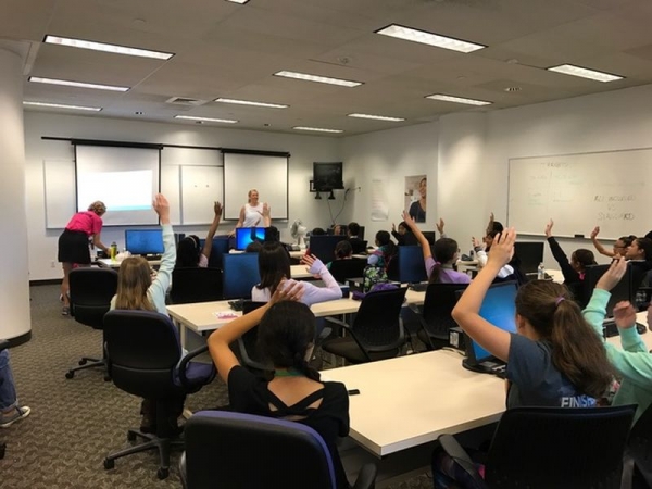
In 2016, one of the teammates I had trained earlier in the year joined me in conducting interactive design thinking workshops for middle school and high school women interested in technology. Read more about our contribution here: AT&T hosts Girls in Future Technologies (GIFT) Day.

We continued that momentum and ran another workshop for the AT&T Technology Development team. Soon after, she began hosting her first workshops on her own.

Applying Design Thinking

With her new skills, one Foundry designer led a joint design thinking project for AT&T and Ericsson. I coached her as we developed a ten week plan to apply design methodology to AT&T’s Mobile and Voice team’s search for new business growth opportunities.

We began the project with market and user research to dive into the problem space and identify a key theme to explore further.

Then, we worked with an external design thinking consultancy to conduct a workshop for Ericsson and AT&T Mobile and Voice team members.

In the third phase of the project, we applied the design process to the business unit’s previously identified theme. The team began by empathizing with users and ended with prototyping and testing with users.

The insights and tested prototypes led to direct product roadmap changes for new use cases and features. In the long term, we infused leaders in the AT&T Mobile and Voice team with the tools and mindset to operate outside of their current structure and processes so they can be as agile as their competition.

The Impact

My design thinking training and coaching increased the amount of design occurring at the Foundry. Through training, we grew new Design Thinkers amongst our greater team. With coaching, we honed skills and amplified our ability to apply design thinking to more projects.

Our workshops were so successful that we were annually invited to train internal teams and GIFT students. There were so many requests that we began being more selective with our workshops so that we could focus on our design projects.

My design team repetitively identified and solved difficult problems in short periods of time. When one of my interns dug into the needs of Uverse and DirecTV technicians—research that lasted no more than three weeks—he uncovered so many high impact opportunities that the responsible Senior Vice President allocated millions of dollars to address these findings.

Biosense ToucHB Website
  • Client: Biosense
  • When: 2011
  • Team: 2 Designers and Developers
  • My Role: Designer and Developer
Overview

In the Fall of 2011, I had the opportunity to re-design and develop a new website for an Indian medical electronics startup. Along with a friend of mine, we conducted initial user and market research, designed the user experience and interface, created all graphic and visual design assets, and developed the website using HTML, CSS, and JQuery for a remote client half-way across the world in India. We both had full-time positions as Mechanical Engineers at the time and used our evenings and weekends to work on this project.


Finished Biosense ToucHB Website product page in browser UX mockup

Problem Statement

Every minute, two people in the world die from Anemia–a completely curable disease! One may think that perhaps the cure is not well distributed, but that is not the case. In fact, the weak link in the chain boils down to lack of accurate diagnosis. With a false positive diagnosis and treatment, dangerous complications occur. With a false negative diagnosis, no life-saving treatment is offered.

Biosense’s TouchHb product addresses this key moment in the chain by providing a reliable, portable, non-invasive diagnostic to healthcare workers. TouchHb targets mobile healthcare workers in rural India with its low cost and minimal profile.

Our client asked us to re-design the existing Biosense website so that it was easier to use and more engaging.

Existing Biosense ToucHB Website before we began redesigning

Design Research

After determining that the website’s target audience would be the health care workers in the field and potential investors as opposed to the rural patients, my partner and I began with researching how to best design a site that could convince our target audience that TouchHb was a valuable product in which to invest.

We studied the history of anemia, key statistics, and existing solutions. We learned that though information was plentiful, it was not common knowledge and scattered.

We interviewed potential website viewers. With investors, we found that our biggest obstacle with was demonstrating the importance and need of TouchHb for people of the emerging world. Investors often did not realize the extent of the problem and how a solution was right at their fingertips. As we interviewed healthcare workers, we learned that many were entrenched in the mindset that reliable anemia diagnostics were only available at larger hospitals and had to invasively draw blood. We needed to make it clear that that was not the only option available to them. A portable and non-invasive solution could now be purchased by individuals at a fraction of the cost.

We researched how to best share our knowledge and achieve these goals, and came to the conclusion that our website needed to tell a story. From there, we began designing and prototyping what an immersive storytelling experience might be.

Storytelling Information Architecture and User Experience

As we dove into the storytelling and user experience, we worked to simplify our story down to absolute essentials. A full-page, immersive slideshow analogy began to form as our chosen tool of expression. We strove to make our design friendly, engaging, informative, and a clear call to action. We wireframed various iterations out on the whiteboard as we cycled through this process.

Biosense ToucHB Website Story Architecture whiteboarding

Since my partner and I were both the designers and engineers on this website, we were careful to design a website that achieved all our goals independently from engineering challenges. After we were confident in the framework of our design, we determined what the best way to code our solution. Naturally, we faced some key engineering tradeoffs. For instance, we wanted to use a CMS, but realized that our schedule and resources would not allow us to complete the design we wanted with a CMS.

Biosense ToucHB Website Development plan whiteboarding

When we handed off the completed website design to our client, we provided them with all the final code, visual assets, and a
guide to the code.

Landing Page User Interface and Visual Design

On the visual design side, we followed a similar process of iterative design with colors, graphics, photography, and individual page layout. Throughout the process, we checked in with our client to make sure that they were satisfied with our progress and we tested our designs through interviews, usability tests, surveys, and A/B testing.

We settled on using a theme of warm colors that had earthly tones along with a red to subtly reference the blood associated with anemia.

Biosense ToucHB Website theme colors

Let’s dive into our process for the front landing page. Our process for all the other pages was extremely similar.

For the front page, we created initial wireframes of full-screen slideshows as well as framed sliders. We explored where we wanted information to be presented, and how we wanted to indicate how a user was to interact with and move through our story.

Biosense_FP-Wireframe1
Biosense_FP-Wireframe2

As we regularly checked in with our client, we created prototypes to share our progress. We started with simple static prototypes and gradually progressed into functional prototypes.

Biosense_FP-Prototype1
Biosense_FP-Prototype2

Once we were confident with the framework of our website, we began prototyping our visual assets. We had several photoshoots where we played with colors, framing, and composition. In our first photoshoot, we rented a nice lens and photographed ourselves in preparation for when we hired a model and on the off chance we did not need one. After looking through our shots, we needed a model.

Biosense_FP-Photoshoot1
Biosense_FP-Photoshoot2

In our second photoshoot, we hired a model and coached her through the session. We played around with various backgrounds, attire, facial expressions, positioning, subjects, lighting, and composition. At the end of our session, we had a massive library to chose from for our story.

Biosense_FP-Photoshoot5
Biosense_FP-Photoshoot7
Biosense_FP-Photoshoot8
Biosense_FP-Photoshoot3
Biosense_FP-Photoshoot6
Biosense_FP-Photoshoot4
Biosense_FP-Photoshoot9

After choosing our top images, we created rough static mockups of key pages side by side for feedback. We used side by side comparisons to determine our final combination of photographs.

Biosense_Mockup1
Biosense_Mockup2

Finished Biosense ToucHB Website front page in browser UX mockup

Learn More

If you would like to learn more about Biosense’s ToucHb, watch their TEDx talk: A 20 second blood test without bleeding from 2013.

IBEKA Easy Distillation for Indonesian Farmers
  • Client: IBEKA
  • When: 2010
  • Team: 2 Mechanical Design Engineers and 2 Business Analysts
  • My Role: Mechanical Design Engineer
Overview

From March 2010 to June 2010 as part of Stanford d.school‘s prestigious Entrepreneurial Design for Extreme Affordability class, I worked with a diverse team of four, including Engineers and MBAs, to help rural Indonesian farmers earn fast cash from the weeds in their farms and simultaneously minimize deforestation.

With The Easy Steam Machine, rural Indonesian farmers can increase their income. The Machine provides them an efficient way to produce steam for their home essential oil distillation units. By reducing the time to produce steam from hours to just a few minutes, The Machine enables farmers to process at least 25% more biomass per day! Time is saved by (1) increasing surface area, (2) heat insulation, and (3) including a continuous water flow through system. As a $230 plug-and-play replacement for the traditional batch drum, the Easy Steam Machine ensures durable, hassle-free steam distillation.

The Easy Steam Machine speeds up the weak link in an existing system by two orders of magnitude. Using our boiler technology, we were able to reduce distillation time from 3 hours to 3 minutes!

Indonesian Traditional Batch Drum Distiller

Traditional Batch Drum Distiller

The Easy Steam Machine Boiler System for Distillation Units

The Easy Steam Machine

The Opportunity

We worked with IBEKA, our NGO partner in Indonesia, to identify the core need of these farmers. For one week, two of my teammates visited, observed, and interviewed these farmers in their fields. We noticed that these farmers were battling with lemongrass as a weed in their farms, and as a result, expanding into fresh rainforests as they struggled to keep their farms going so they could support their families.

Interestingly, most farmers had systems in place to convert their lemongrass into crude lemongrass oil, which they could easily sell for fast cash. However, these distillation systems were left unused, because it took them three hours of valuable time to boil the water necessary to begin the distillation process.

Need Statement

Subsistence farmers in Indonesia need a way to process all of their lemongrass and patchouli into higher value essential oil. Currently, farmers leave up to twenty-five and seventy-five percent of their plant material unprocessed because their essential oil distillation device is too cumbersome and time-intensive. Given the short harvest period and the low throughput of their device, farmers must leave potential income in the field, unprocessed.

The Solution

In order to increase the quantity of oil output, we focused on increasing both the throughput and the yield, i.e. doing a faster job and doing a better job. The Easy Steam Machine is a replacement, plug-and-play device that fits directly into the traditional system — which makes it less expensive than purchasing an entirely new device. It also lowers the barriers to adoption because farmers will feel familiar with the design and user interface.

Diagram showing Inefficiencies with Traditional Distillation

Inefficiencies with Traditional Distillation

Diagram showing The Easy Steam Machine

The Easy Steam Machine

There are four problems with the existing system that lower throughput and yield: stifled fire, biomass heat loss, poor water-to-fire interface, and high water maintenance. We address each of these with our system by designing a more efficient fire, biomass insulation, higher surface area, and water flow-through.

The Easy Steam Machine speeds up the weak link in an existing system by two orders of magnitude. Using our boiler technology, we were able to reduce distillation time from 3 hours to 3 minutes!

Check out a prototype in action:

Implementation Proposal Plan

IBEKA Easy Distillation for Indonesian Farmers Implementation Proposal Plan UX Mockup

Status

We handed this project over to our partner IBEKA to execute and distribute this among their served communities.

Learn More

Read our implementation plan here.

Read our final presentation here.

Read more about the d.school class Entrepreneurial Design for Extreme Affordability here.

SFCU Video Contest Winner
  • Client: Stanford Federal Credit Union (SFCU)
  • When: 2009
  • Team: 2 Filmmakers
  • My Role: Filmmaker
The Challenge

Create a 60-second video to creatively answer the question: “If every penny counts, tell us how.”

We Won!

SFCU_Winners

Within three days my partner and I wrote, filmed, edited, and submitted A Life Changing Penny! We were living in Beijing at the time, and faced the additional fun challenge of filming in a foreign country with limited resources. We had a blast pulling together this stop motion video, and were fortunate enough to win 1st Place in the competition!

Microsoft Research Asia Enterprise Social Networking Platform
  • Client: Microsoft Research Asia
  • When: 2009
  • Team: Research team of 2 Psychologists and 2 User Experience Designers and Researchers
  • My Role: User Experience Designer and Researcher
Overview

In the Summer of 2009, I moved to Beijing, China to work for Microsoft Research Asia (MSRA) as a User Experience Design Researcher. I worked on a team of two Psychologists and two User Experience Designers/Researchers.

My time at MSRA was divided into two primary projects: Cross-Cultural Design Research and designing an Enterprise Social Networking Platform.

Cross-Cultural Design Research

With our design research, we strove to understand how to design better digital experiences for a Chinese audience. Using qualitative and quantitative research methodologies and usability studies, we honed in on elements that resonated with our target audience. Specifically, we conducted market research and competitive analysis, surveys, interviews, A/B testing, card sorting, walkthroughs, task analysis, facilitated brainstorming, and participatory design.

We conducted much of our research with our Enterprise Social Networking Platform, the Twinkle Project, which in turn informed our design choices and directed our next iterations.

Enterprise Social Networking Platform

Social networks are a fantastic way to generate and share knowledge among large groups of people. Social software has the potential to build and maintain strong communication and collaboration channels. Yet, why do enterprise social software solutions still leave something to be desired?

There is a huge opportunity to apply social software within the Enterprise. The Twinkle Project explores exactly that. Could we redesign and reinvigorate Social Enterprise Software? How can we enable users to connect, collaborate, share content, knowledge, and expertise, manage information, and increase productivity across an enterprise?

As a designer for Twinkle, I was responsible for design research and strategy and UX and UI design.

A blurb about our work on Twinkle was featured in the 10 Year Anniversary MSRA Book (pg. 28).

BMW Head Up Display and Console
  • Client: BMW Research and Technology
  • When: 2008
  • Team: Research team of Psychologists, User Experience Designers and Researchers, Developers
  • My Role: User Experience Designer and Researcher
Overview

Summer 2009, I moved to Munich, Germany to work as a User Experience Design Researcher at BMW Forschung und Technik (BMW Research and Technology). Our ConnectedDrive team was comprised of a diverse group of Computer Scientists, Psychologists, and Designers.

During my time at BMW, I was responsible for Cross-Cultural Design Research and the Design and Research for the Head Up Display, Dashboard, and Center Console On-Board Computer.

BMW Head Up Display HUD Design

Cross-Cultural Design Research

Our goal was to understand how aging societies and growing city size might affect our automotive infotainment design both within Germany and abroad. I researched and analyzed demographic data on aging societies, megacities, and their implication on the automobile and drivers. I also researched the latest findings on augmented reality and how we could apply them to the driver experience.

As the sole Design Strategist, I led the team through Design Thinking workshops and facilitated brainstorming sessions.

Head Up Display, Dashboard, and Center Console

Using our cross-cultural design research as a foundation, we designed innovative interactions, UX, and UI for the Head Up Display, Dashboard, and Cluster Instrument Panel (entertainment and driver assistance functionalities). By conducting quantitative research and usability studies, our designs iteratively improved to achieve our priorities. Specifically, we conducted market research and competitive analysis, card sorting, walkthroughs, task analysis, and eye-tracking with 360 degree dynamic and static driving simulators.

Publications

Our user experience design research on Point of Interest selection was published and presented at the First International Conference on Automotive User Interfaces and Interactive Vehicular Applications (AutomotiveUI 2009) Sep 21-22 2009 in Essen, Germany.

BMW Toggle Strategies for Points of Interest

Toggle Strategies for Point of Interest selection via the iDrive controller

Abstract: The importance of spatial and geo-based information has increased over the last few years. The most prevalent example of this kind of information is points of interest (POI) like hotels, restaurants, gas stations, etc. As cars are made for individual transportation, interacting with geo-based information via the In-vehicle Information System (IVIS) should be possible. At present, state-of-the-art IVIS only permit a list based or center based selection on the map, which makes it difficult to handle a high closeness of geo-based data. In this paper, we present alternative approaches for selecting geo-based data with a multifunctional controller. In our work, visual cues help users predict the selection order. An explorative user study showed potential advantages of our concepts.